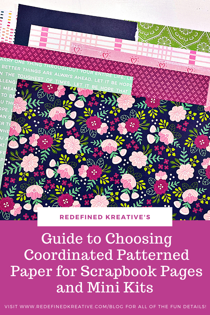
Choosing Coordinating Patterned Paper for Scrapbook Pages and Mini Kits
Hi Friends!
One of the questions that I hear all the time is “how do you choose papers from lots of different collections to coordinate and use together?” This is one of my favorite things to do as I just love creating unique combinations of goodies. I thought that it might be fun to share some of my thought process on how I accomplish this goal.
Typically, I will choose one multi-color paper as my jumping off point. This is a really easy starting spot and gives me lots to work with! For this paper, I usually choose a floral, geometric, or text paper with lots of colors.
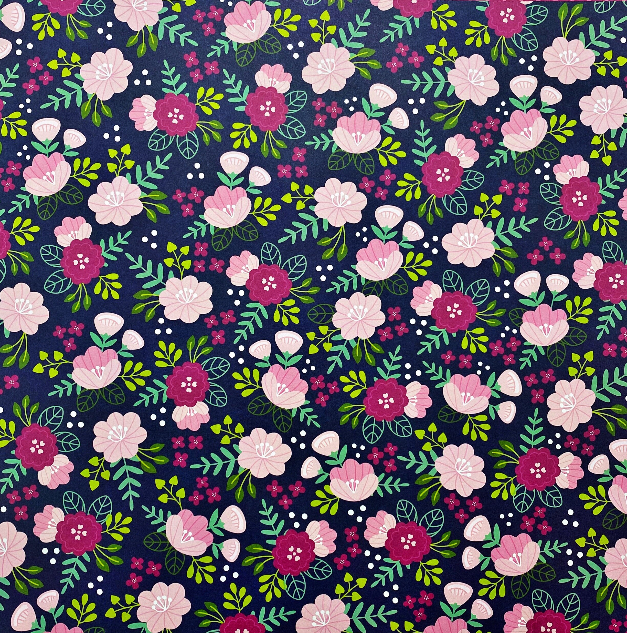
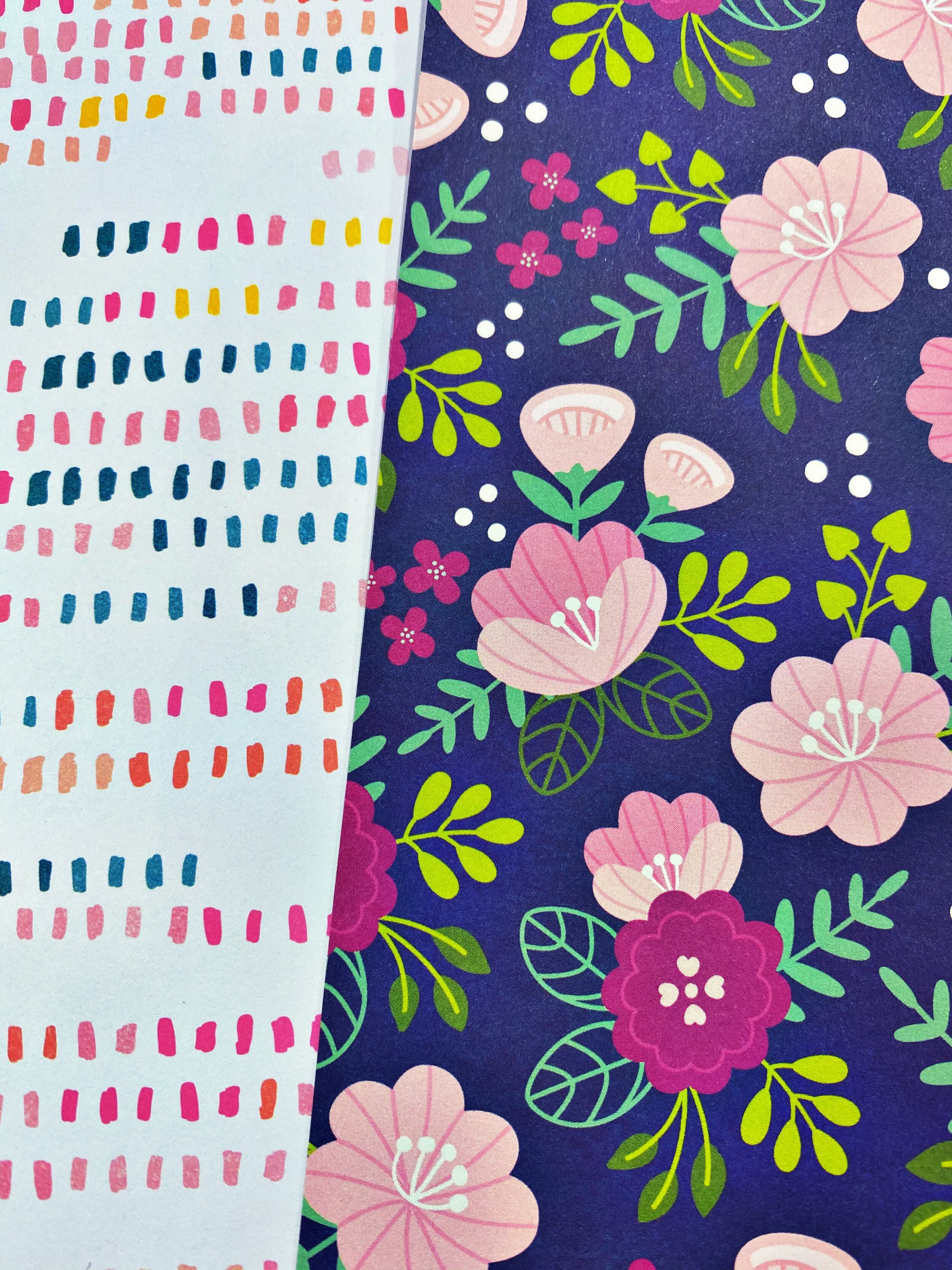
This is the one that I chose for today’s project (Jen Hadfield Chasing Adventures). Here’s why…..It is a gorgeous floral pattern that I can use in sections, use as a background, or even fussy cut. It also has a bunch of gorgeous colors which makes it a lot easier to know how to choose more patterns.

So…..looking a the close-up, I know that I have light pink, lime green, navy blue, teal, darker magenta, and a hint of green to work with. BINGO…I have a workable color combo.
Now, I can dig thru my stash and find patterned papers from other collections that match my color scheme and add a little something unique. For example, I don’t want to grab ten florals and nothing else. I also don’t want to grab a red background or all huge prints. I always think about making sure that I have a variety of types of patterns as well as a variety of sizes to my prints. That helps everything work well together instead of overwhelm the eye.

This lime green paper (Paige Evans Horizon) was the very first one that came to mind. Although it is another floral, it has a slightly bigger pattern so it isn’t
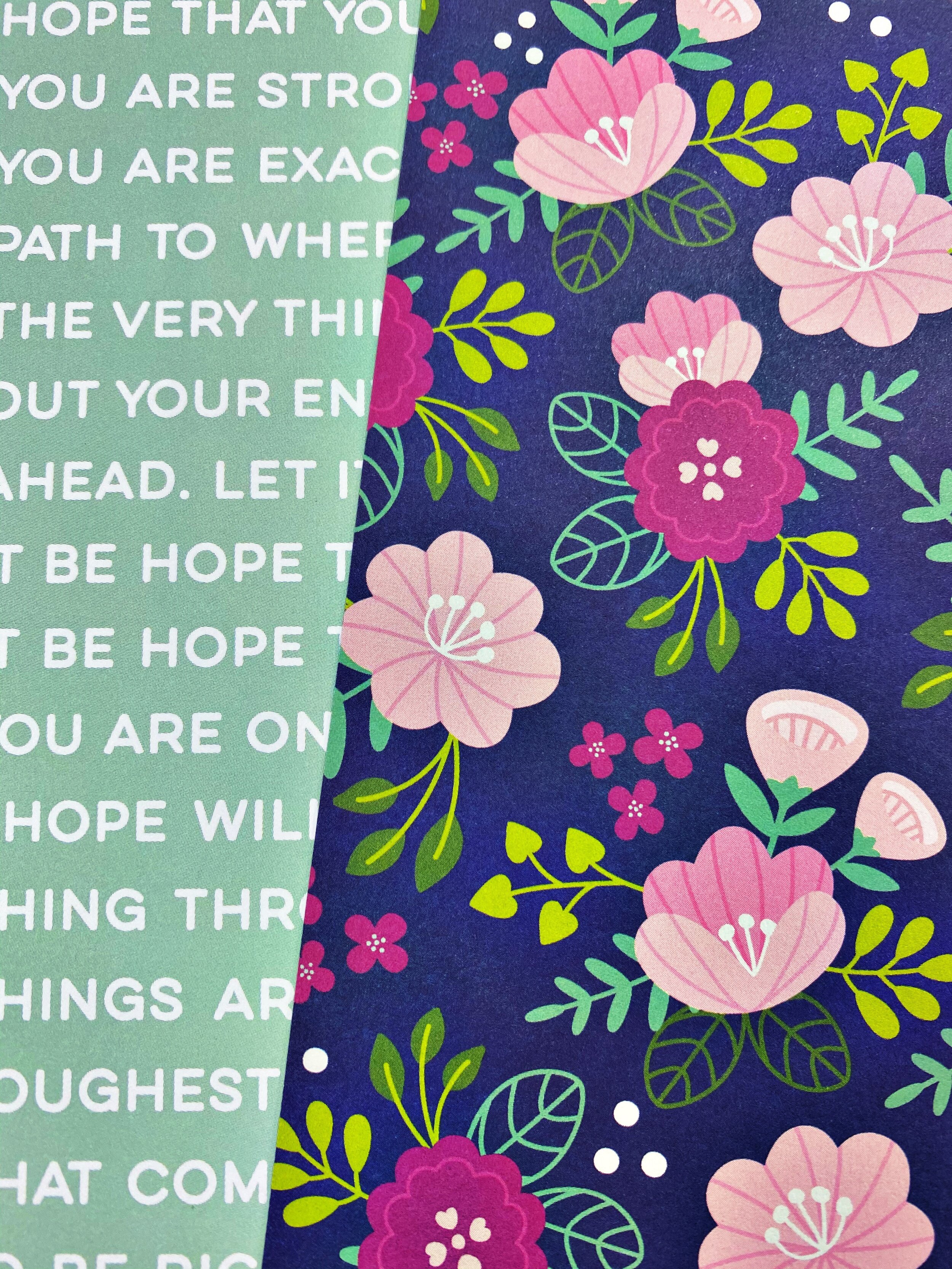
This time, I looked at the other leaves in my patterned paper and found a paper that would coordinate with the light teal. This text paper (Pink Fresh Studio Let’s Stay Home) is perfect because it brings in that teal as well as some white (mimicking the dots in the original patterned paper)
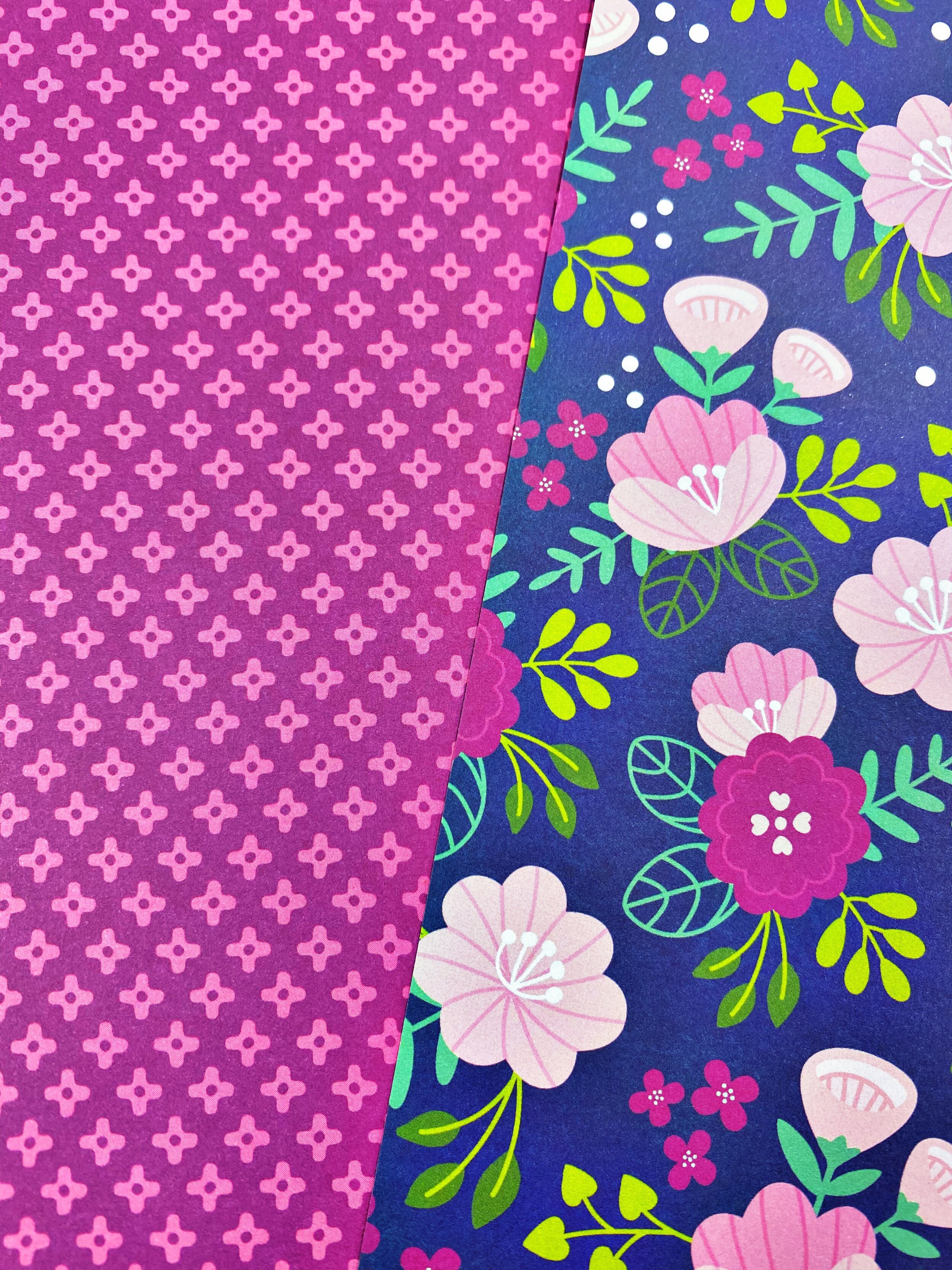
Now…on to matching to my florals. That dark magenta would be a little harder to match to an exact color in a different collection but I definitely needed it in my kit of papers. SO…I went back to the same collection as the floral (Jen Hadfield Chasing Adventure) and found this geometric. It is the perfect color and the pattern is smaller so it makes sense to add this one. I will often choose 1-2 additional papers from the same collection as my inspiration piece just because they are already pre-matched for me!
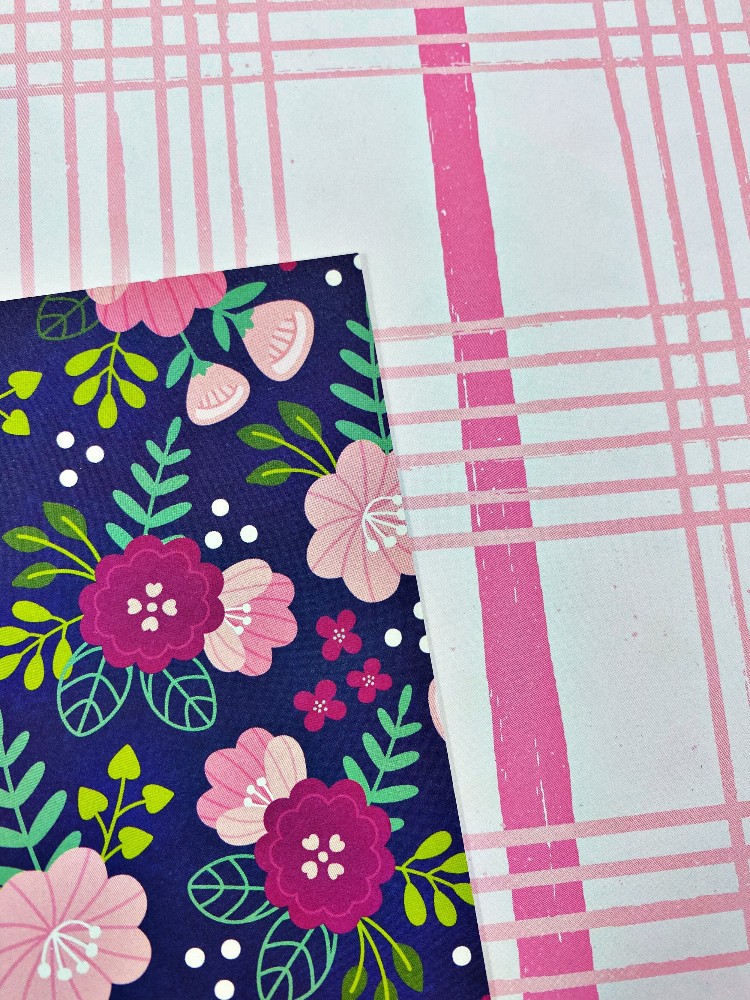
The two lighter shades of pink were pretty easy to match. I brought in a plaid paper (Crate Paper Marigold collection) for this one because it contributed a nice, large open print that could be used as a background or within my layers easily. It was a very natural addition.
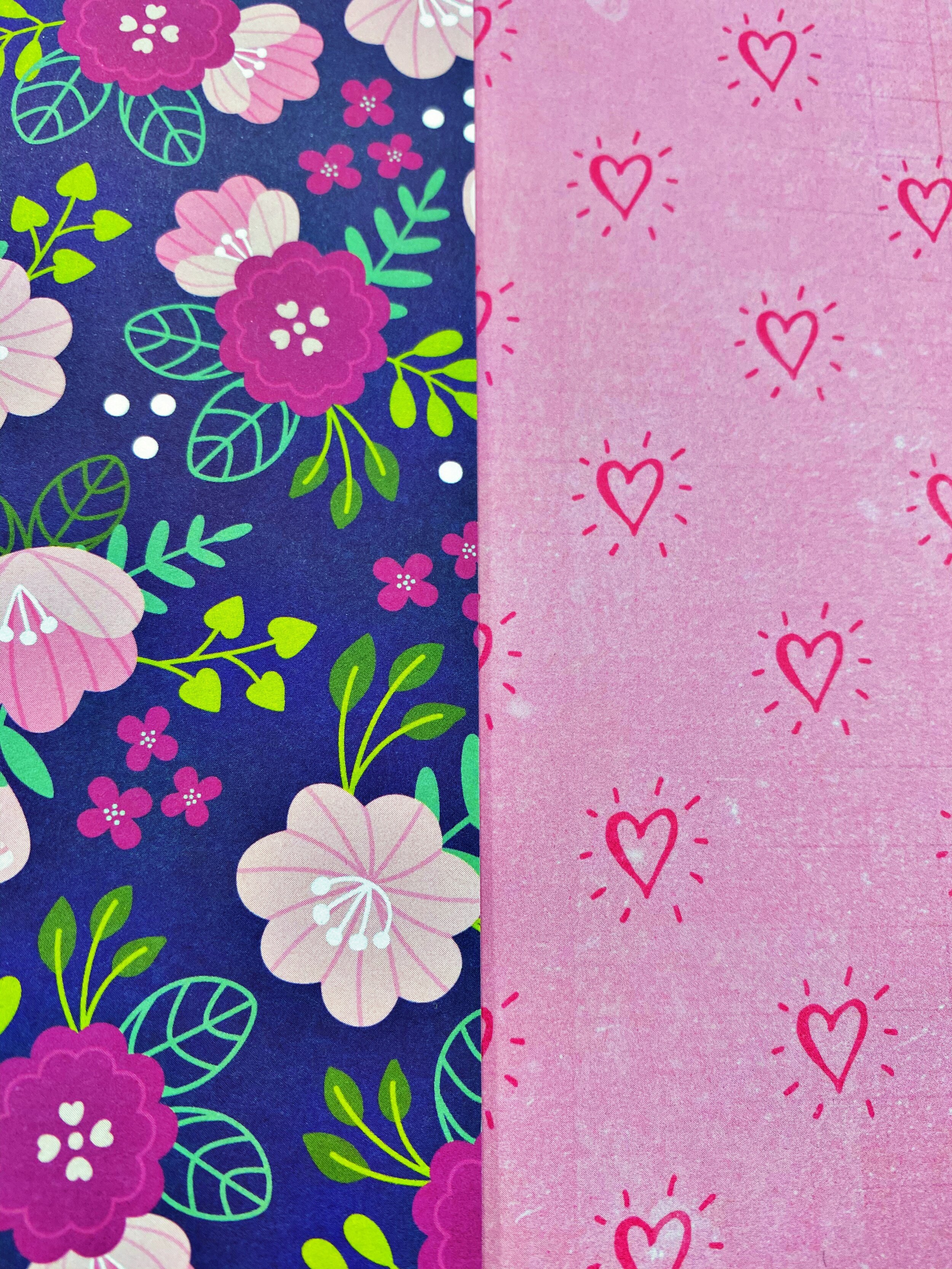
The medium shade of pink was another easy match. This paper with the hearts (Crate Paper Hello, Love) was another perfect addition. It offers a smaller print, something different than a floral, and something that I could use as a big block of color or a tiny strip. Because it is pretty versatile, it will extend the range of my papers. Does that make sense?!
I also pulled in this polka dot paper (Crate Paper Hello, Love). Now, the yellow and orange are a little different but they are in such small amounts that I know that I can cover them up or use them as just tiny accent colors to break up my other coordinated patterns. It also offers a tiny print, lots of color, and would make great layers behind a photo. The white background tends to calm down the busy nature of some of the other papers so it is a good addition here. I also added a piece of navy blue Cardstock but you could easily pull in a navy blue patterned paper here too. This will help being in another pop of navy to tie all the things together with the inspiration piece.

So….when you look at these patterned papers together, you get a very cohesive feel. There are lots of options, the pattern sizes and colors are well balanced, and you can jump right into creating! Even though we combined paper from five different collections (both old and new), it still creates a really fun and dynamic set of papers to use. Depending on your style, you should be able to get a few layouts from this one paper selection.
I hope that this little tutorial helps give you some ideas of how you can create a similar set of papers to use no matter how old, new, big, or, or small your stash happens to be! I have so much fun combining different collections into unique ways and I can’t wait to see what combinations you create with these tips! Make sure to come on over to our Facebook page where I share my process of creating a layout from these patterned papers. Click here to find us over there!
xoxo,
Khristina
Make sure to pin this article to your scrapbooking inspiration boards on Pinterest so that you can find it and use these tips any time you want to create a set of coordinating patterned papers. Just simply click in the top left corner below to save this pin.